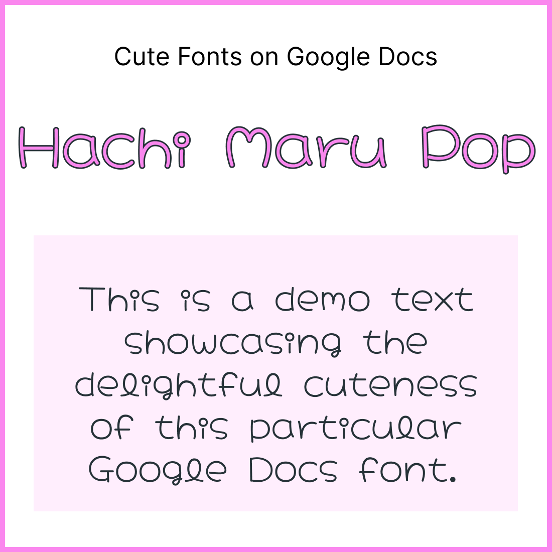
While Arial, the default font in Google Docs, is a highly readable and popular choice, it might not always be the most fitting.
Take lesson plans for children, for instance. Here, using a touch of “cute” in the headings can make the document more engaging and connect better with young readers.
However, it’s important to remember that cuteness often comes at the expense of readability.
Compared to standards like Arial and Times New Roman, these fonts can be a little trickier to read. Therefore, it’s best to reserve them for headings or short bursts of text.
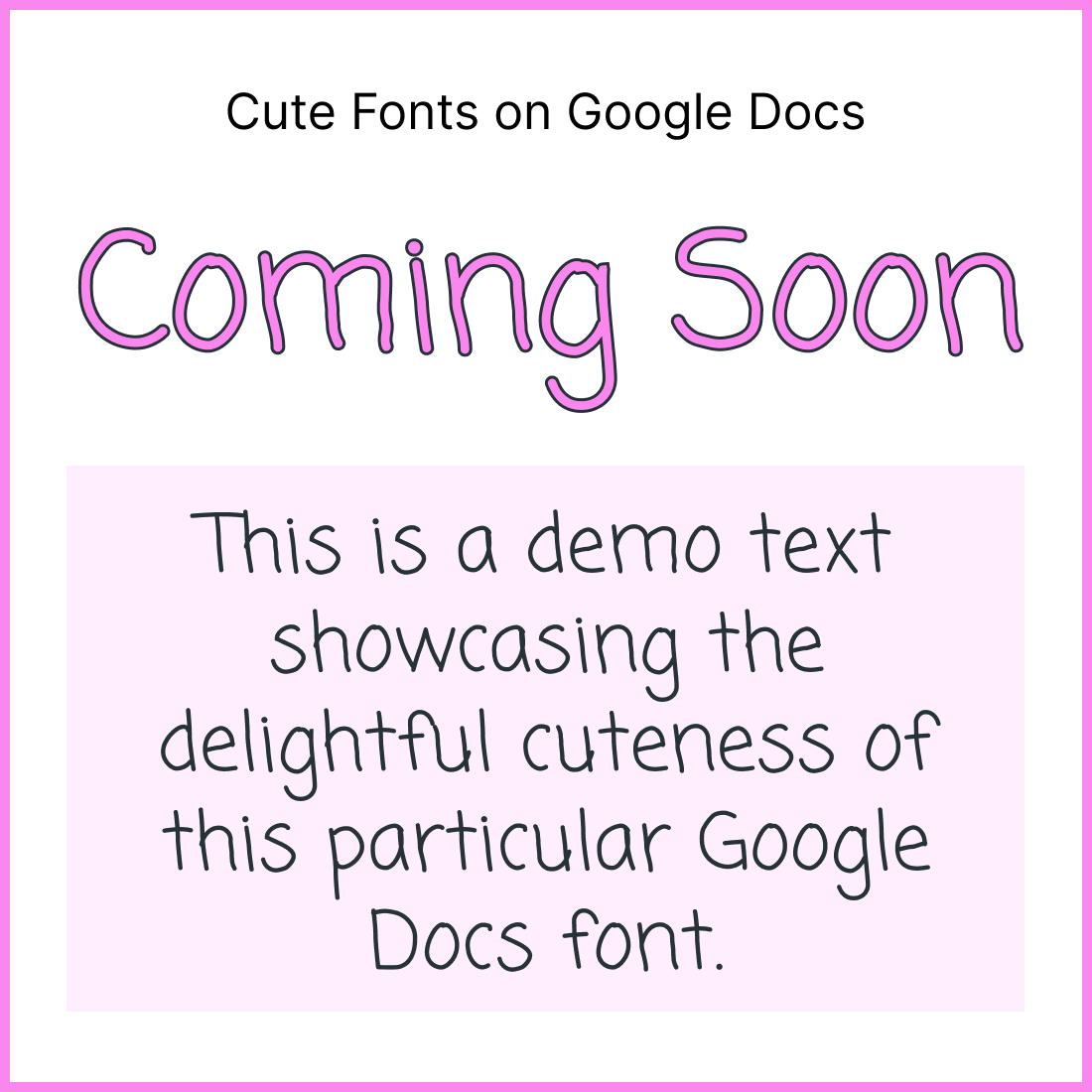
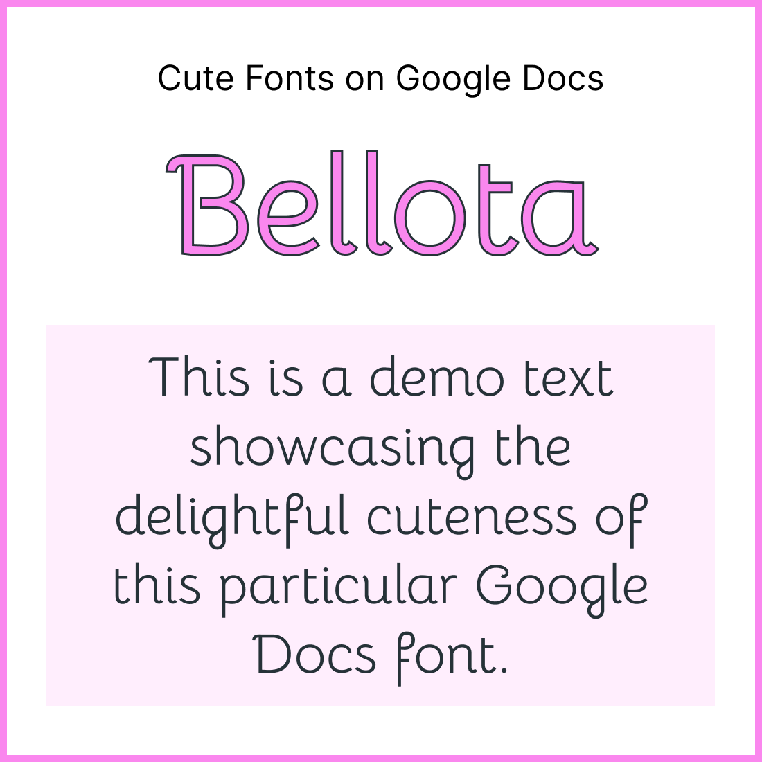
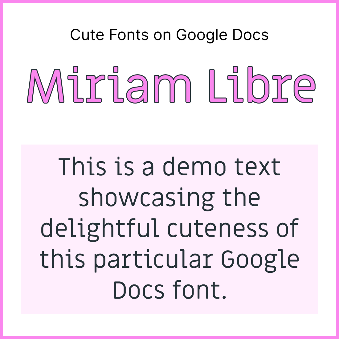
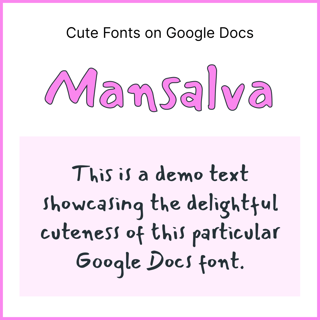
This article will showcase 35 of the best “cute” fonts for Google Docs, along with screenshots for each to help you pick the perfect one!
Also read (opens in new tab):
23 Best Typewriter Fonts for Google Docs
27 Most Aesthetic Fonts on Google Docs
Here are the Best Cute Fonts on Google Docs:
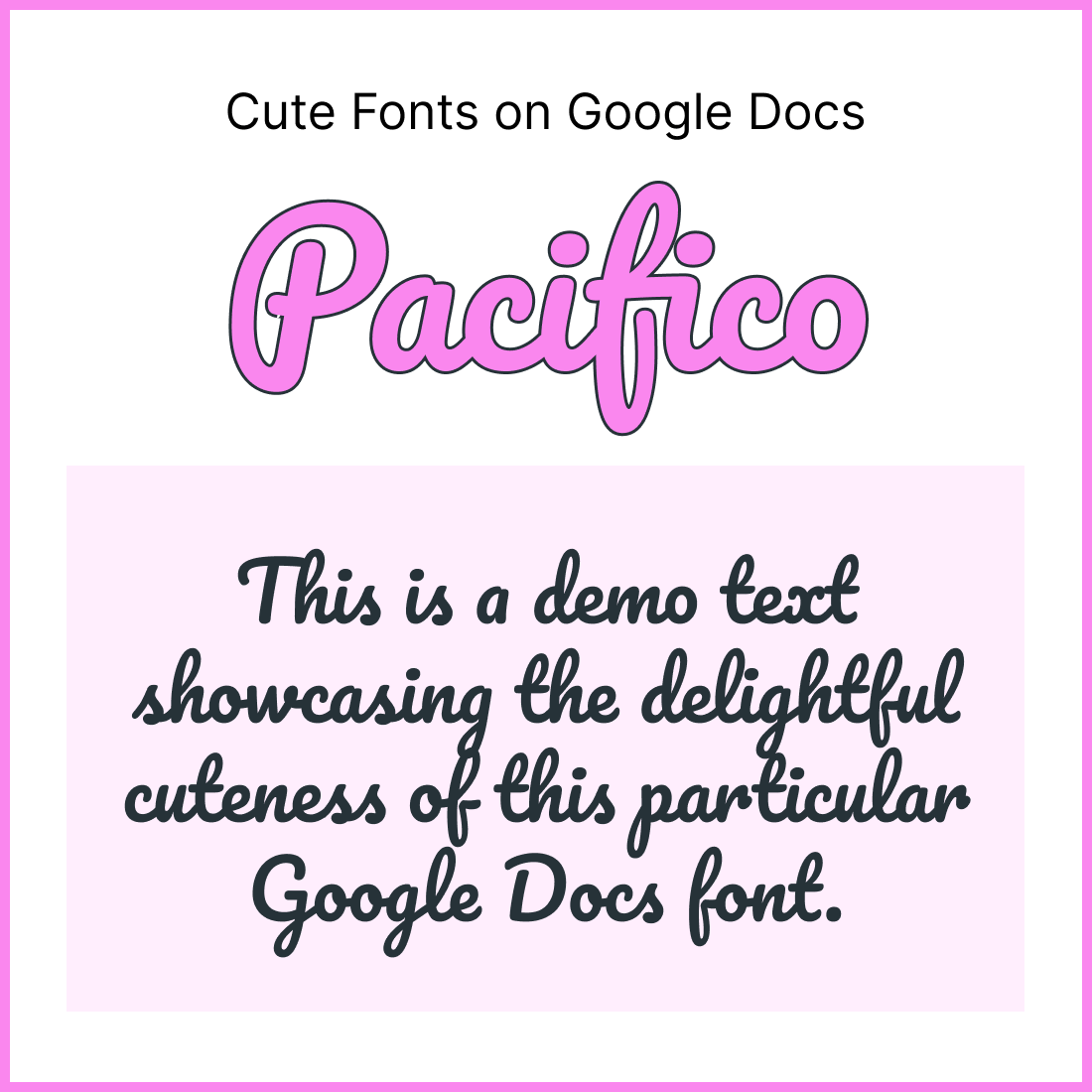
1. Pacifico
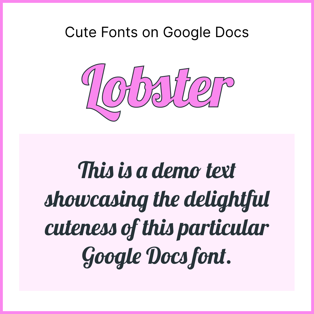
2. Lobster
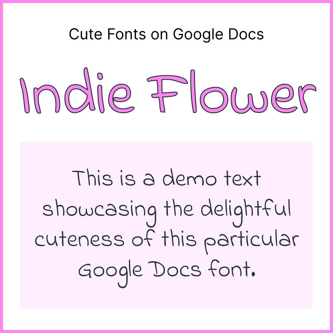
3. Indie Flower
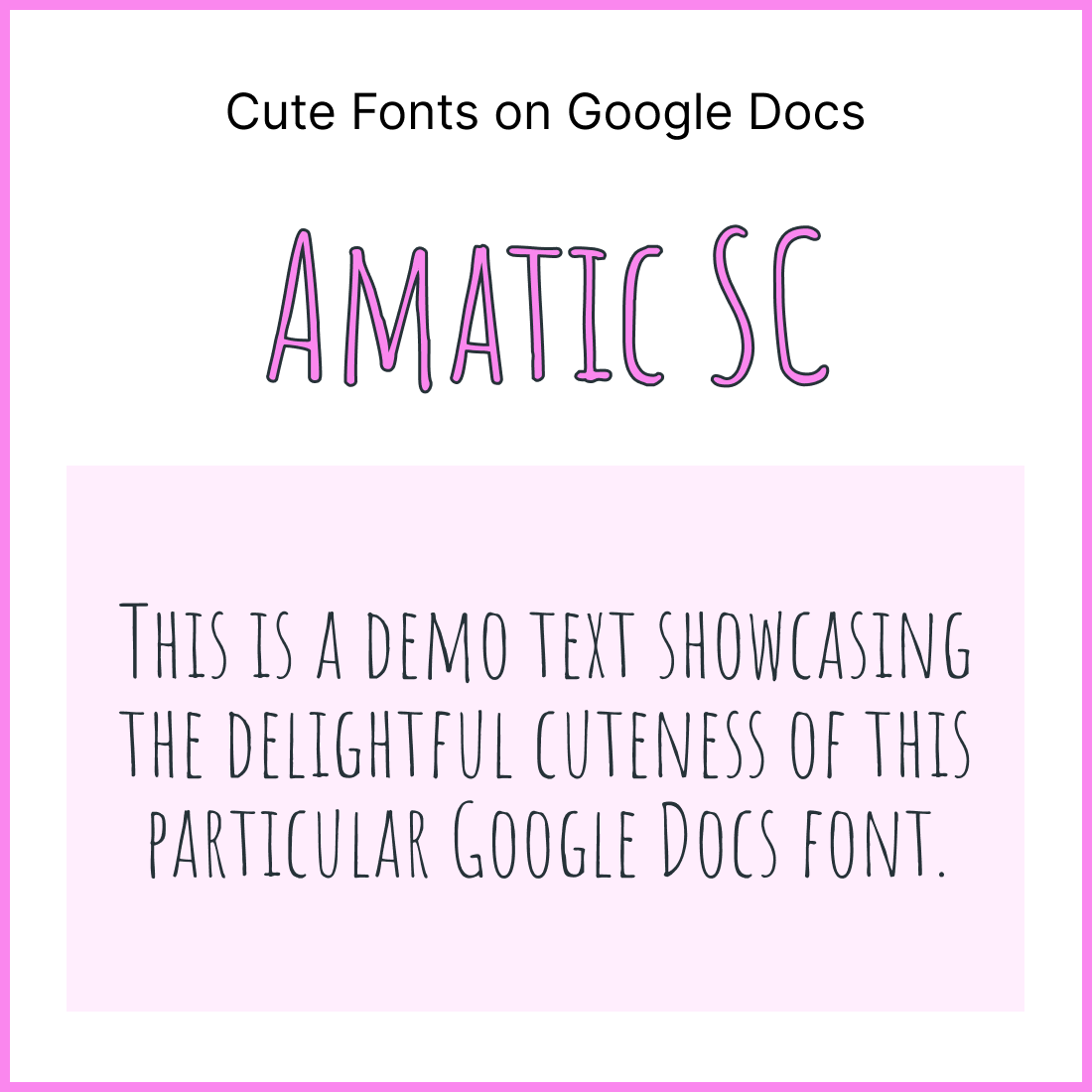
4. Amatic SC
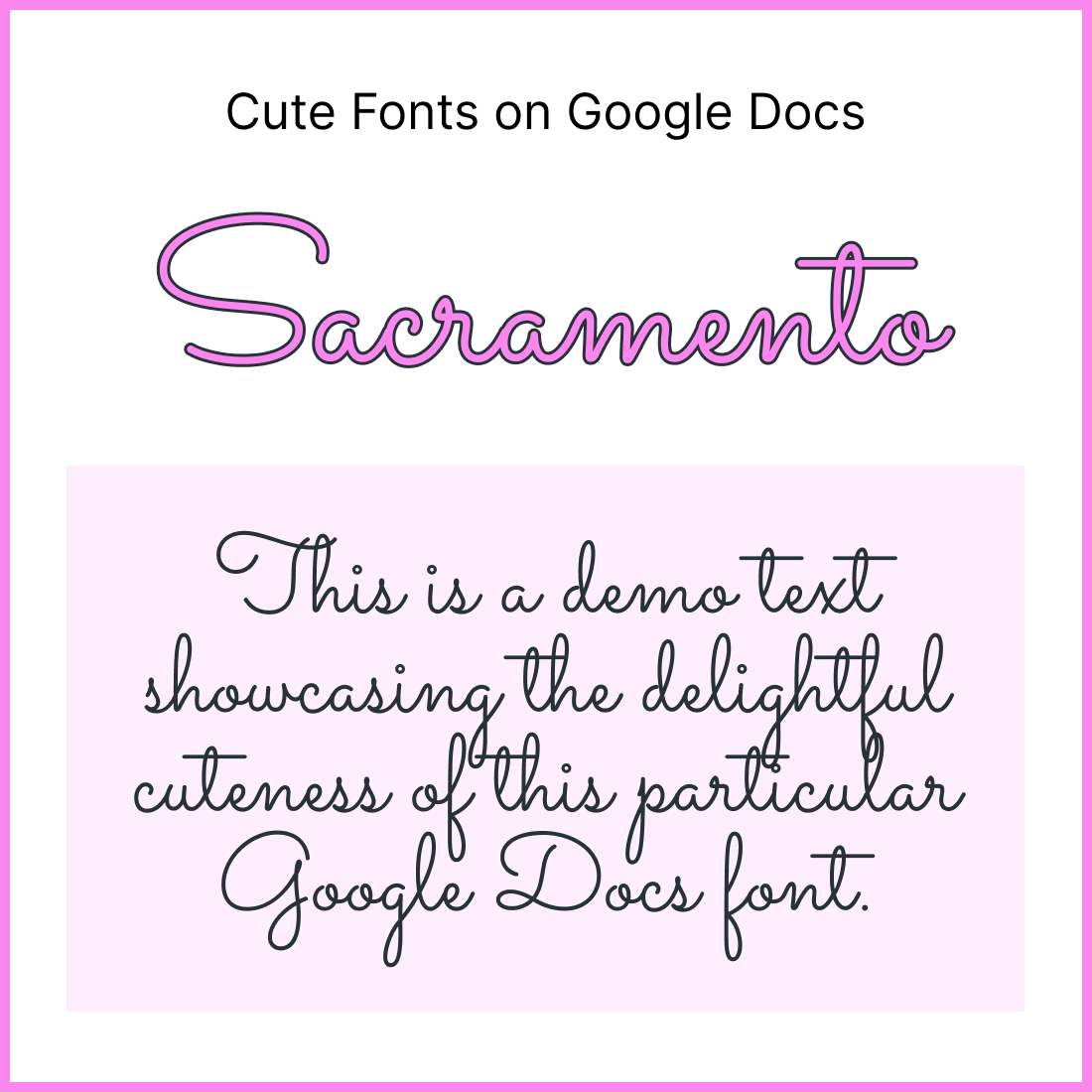
5. Sacramento
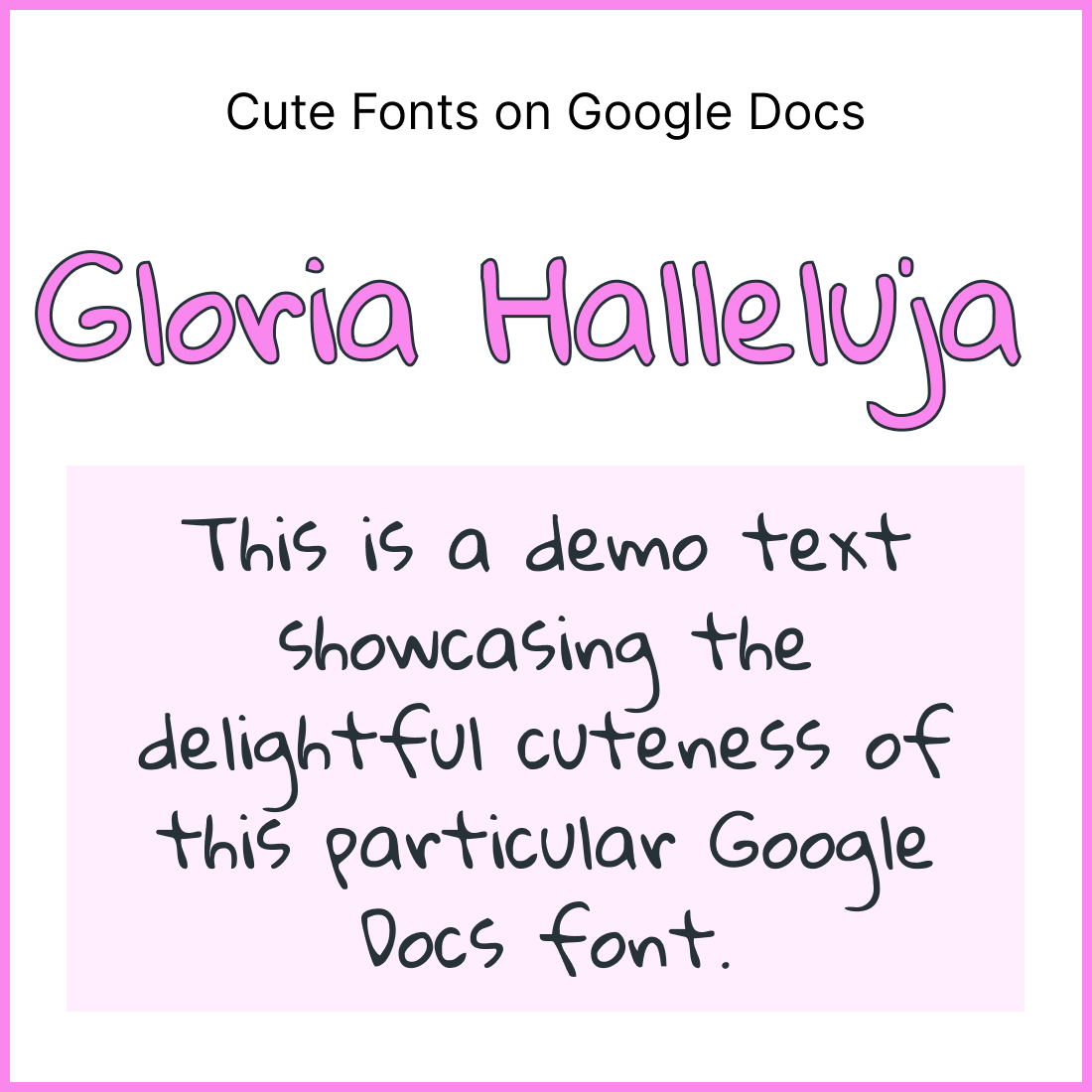
6. Gloria Halleluja
7. Architect’s Daughter

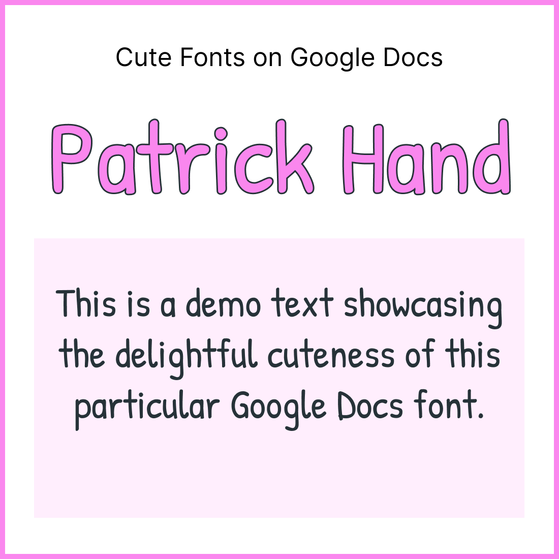
8. Patrick Hand
9. Handlee
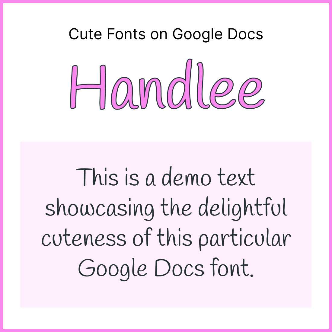
10. Comic Neue
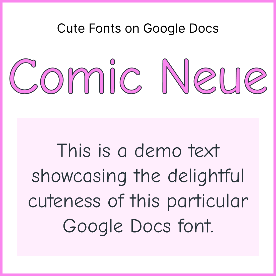
11. Pangolin
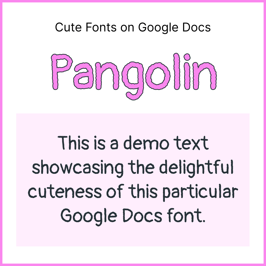
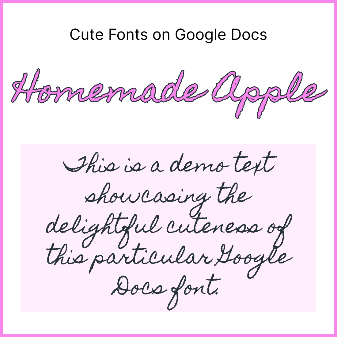
12. Homemade Apple
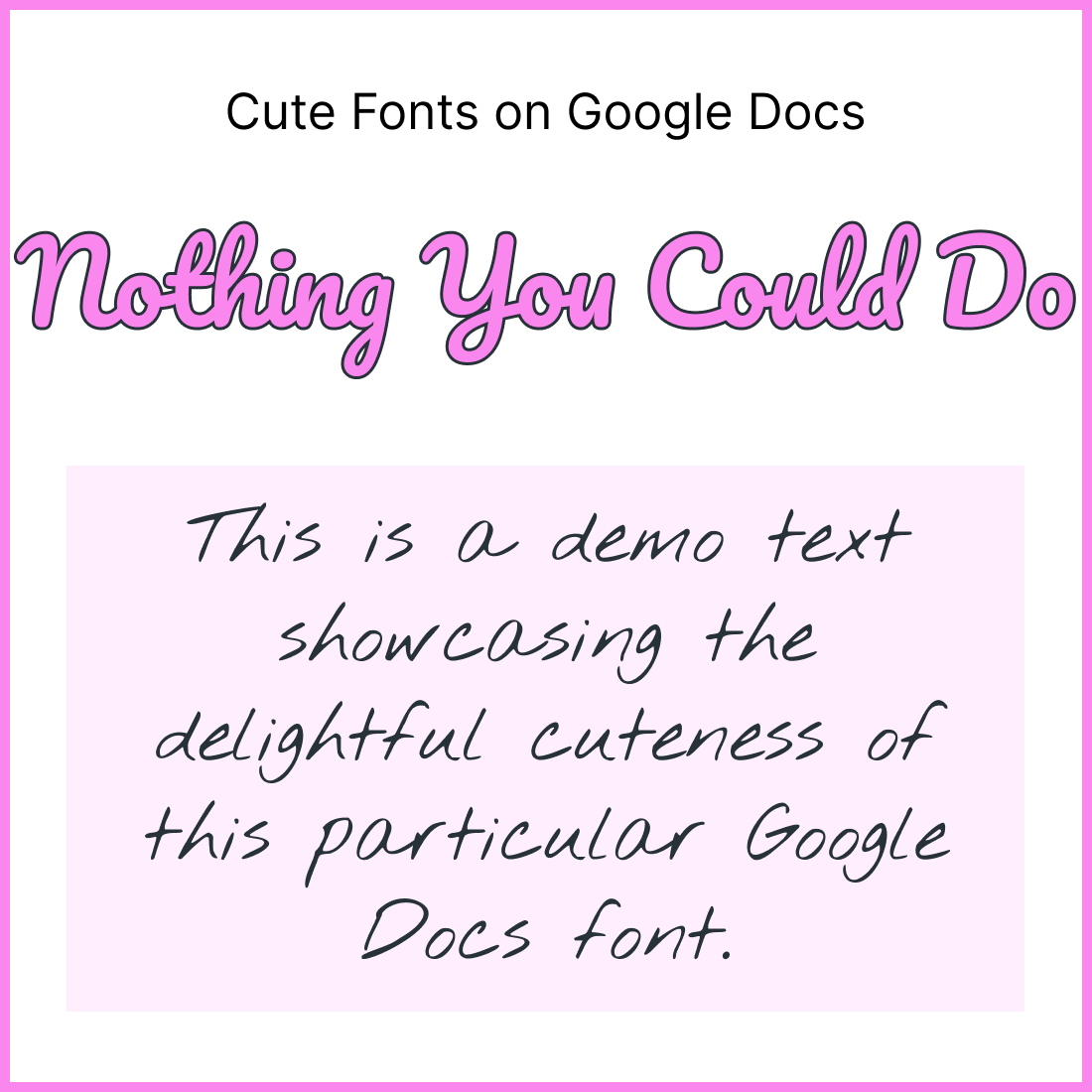
13. Nothing You Could Do
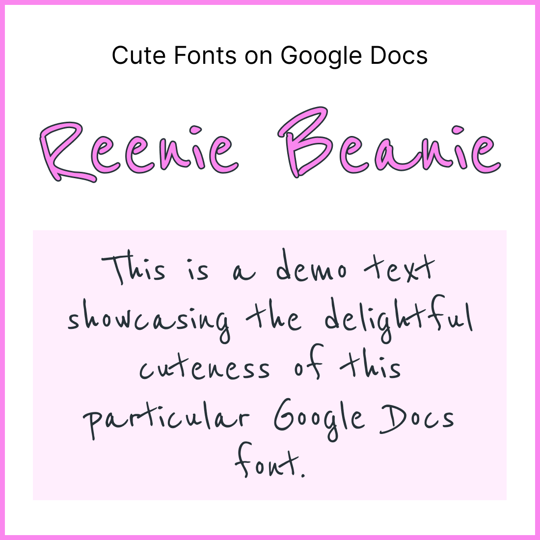
14. Reenie Beanie
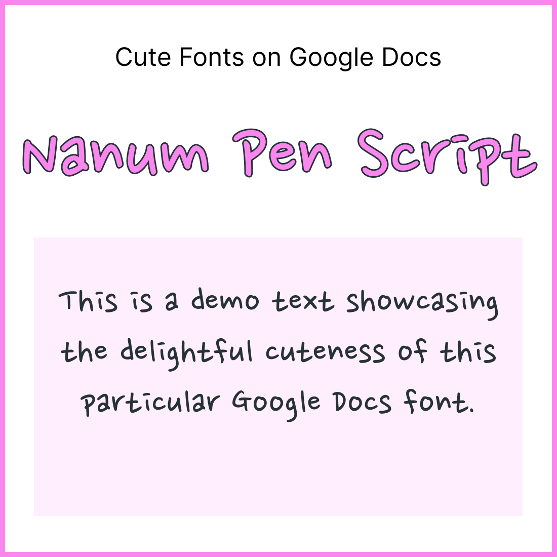
15. Nanum Pen Script
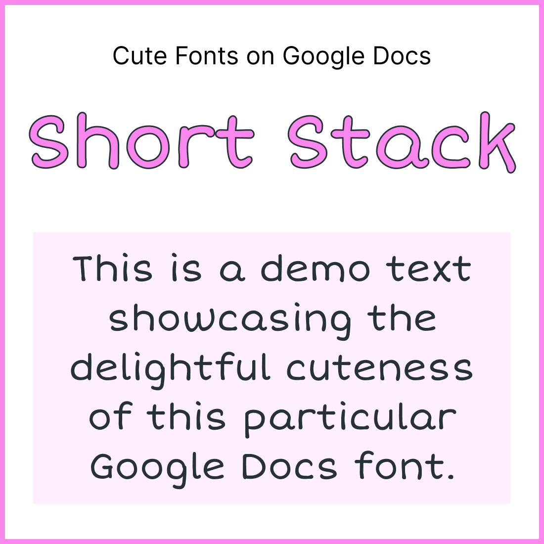
16. Short Stack
17. Delius
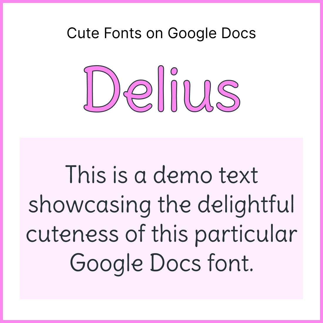
18. Mali
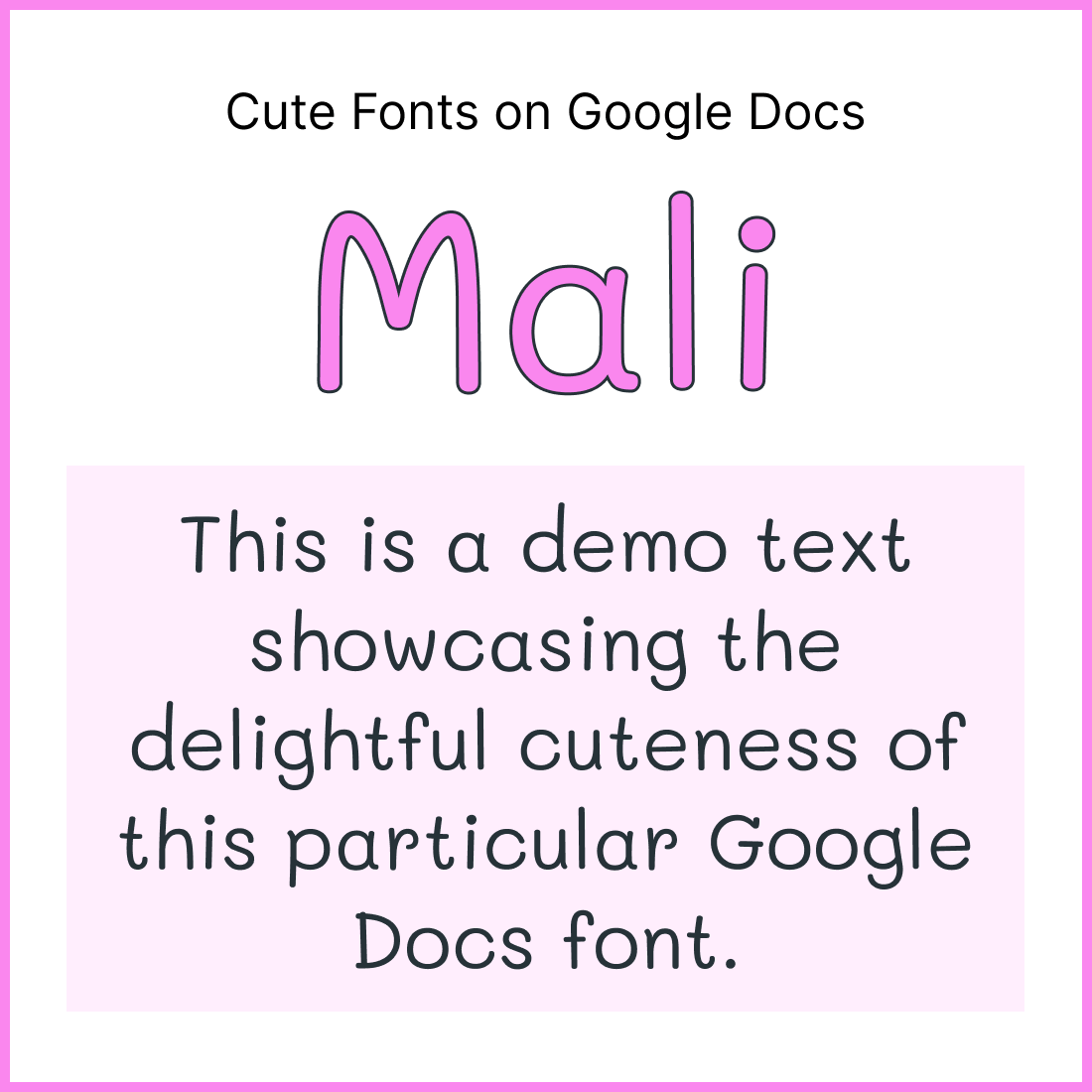
19. Shadow Into Light Two
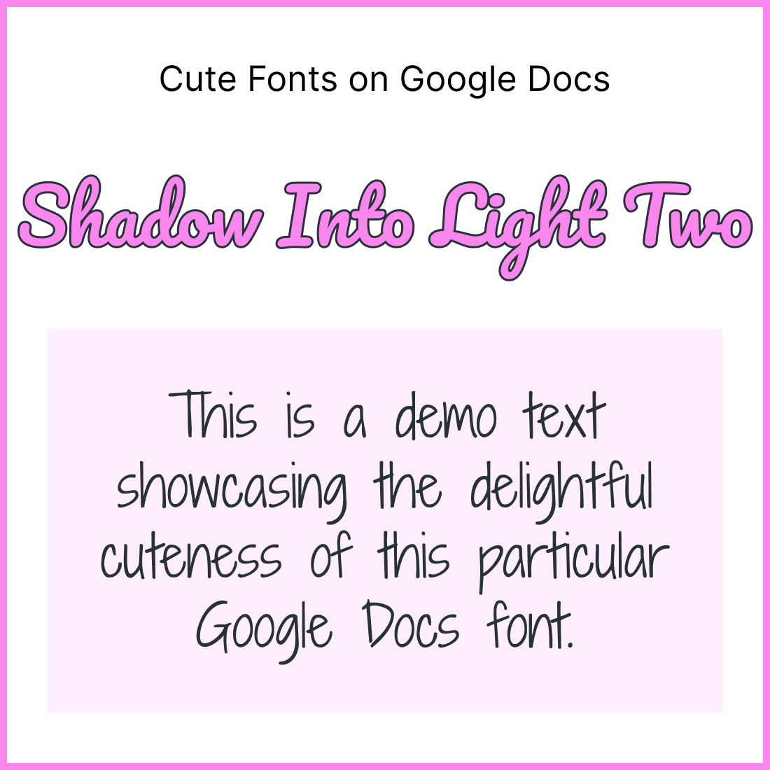
20. Annie Use Your Telescope
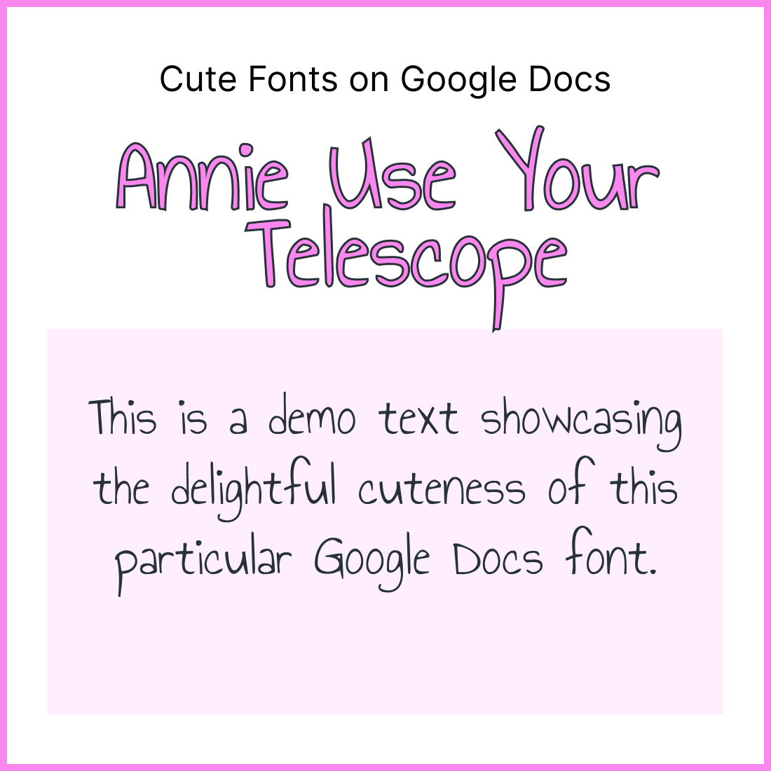
21. Coming Soon
22. Bellota
23. Miriam Libre
24. Mansalva
25. Love Ya Like A Sister
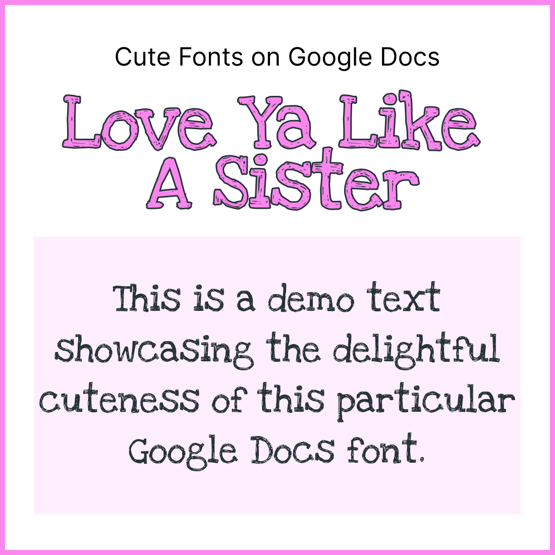
26. Oooh Baby
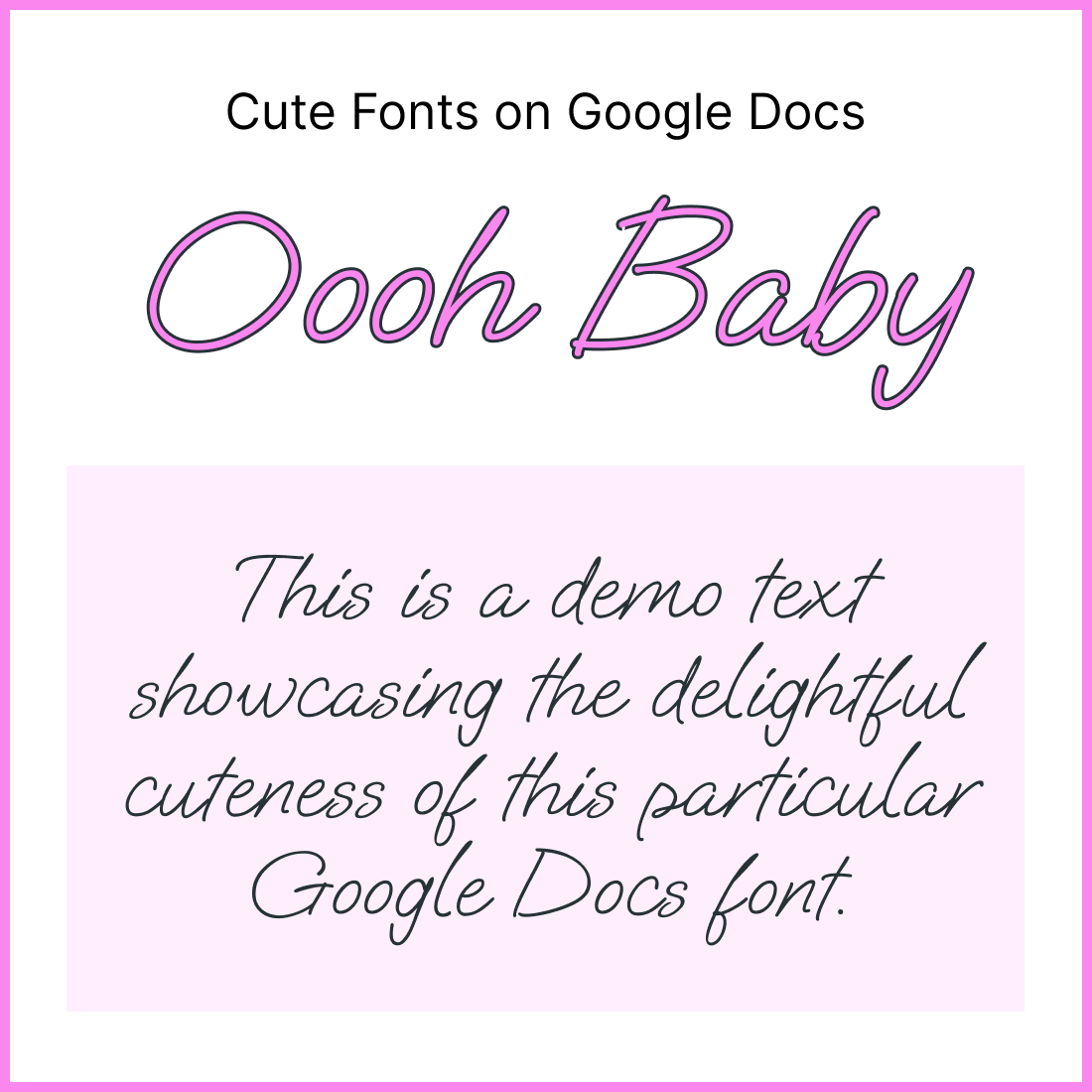
27. Biz UDGothic
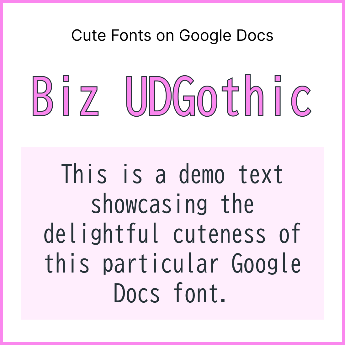
28. Crafty Girls
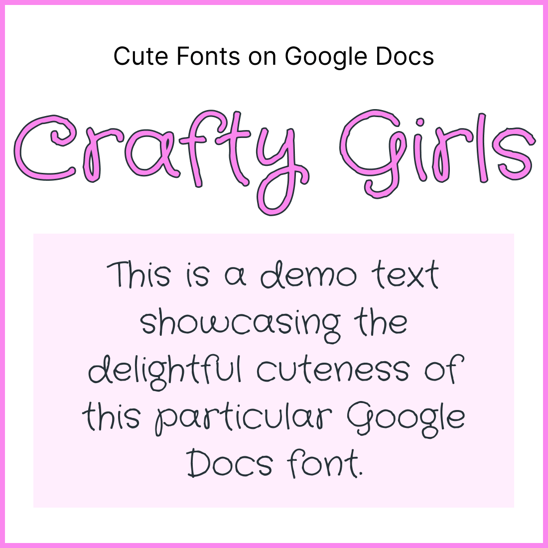
29. Sue Ellen Francisco
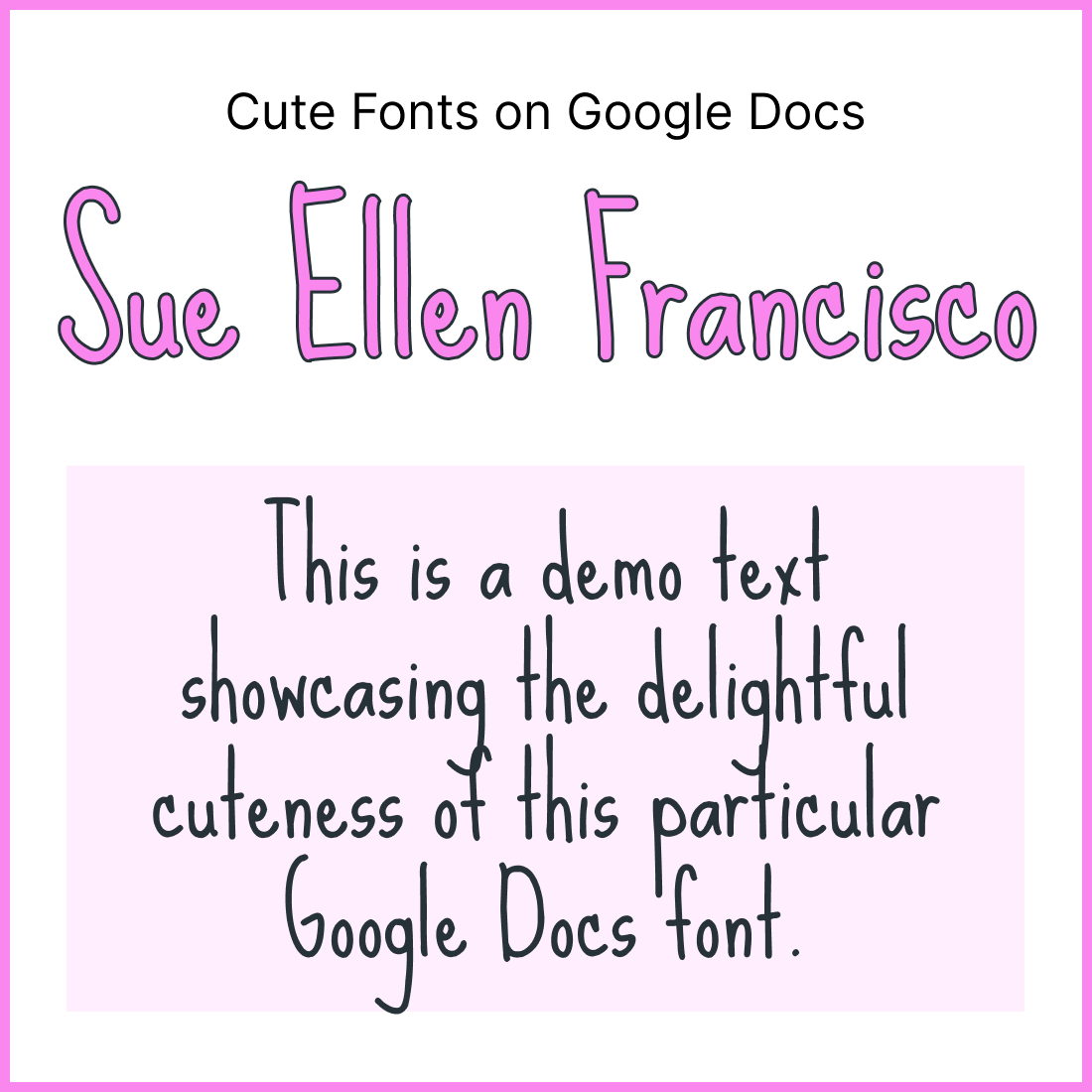
30. Mountains Of Christmas
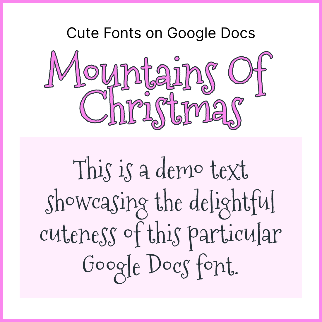
31. Over The Rainbow
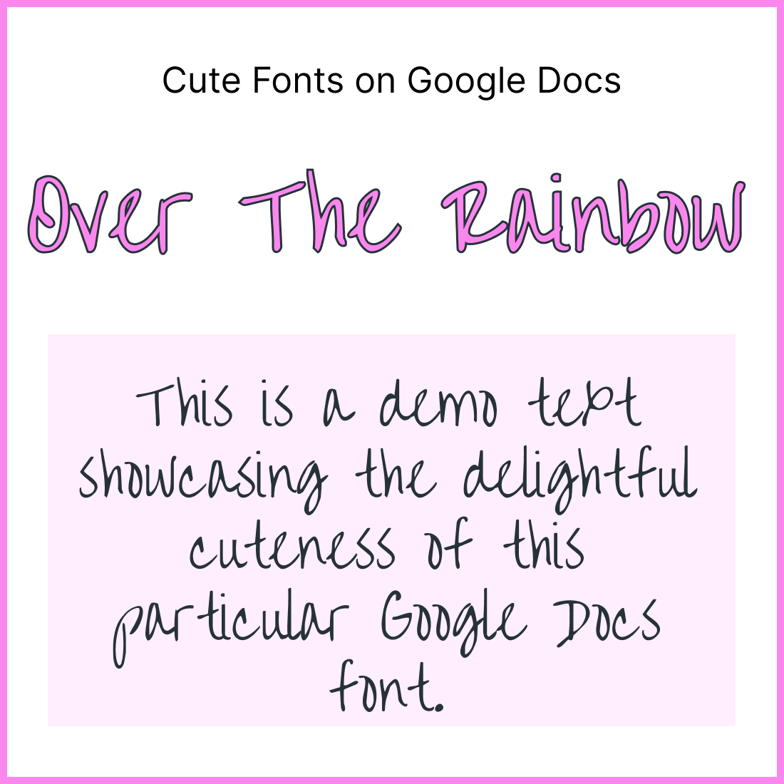
32. Patric Hand SC
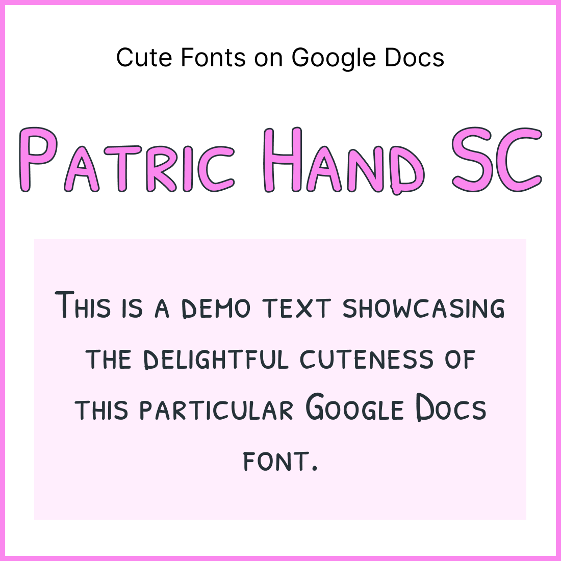
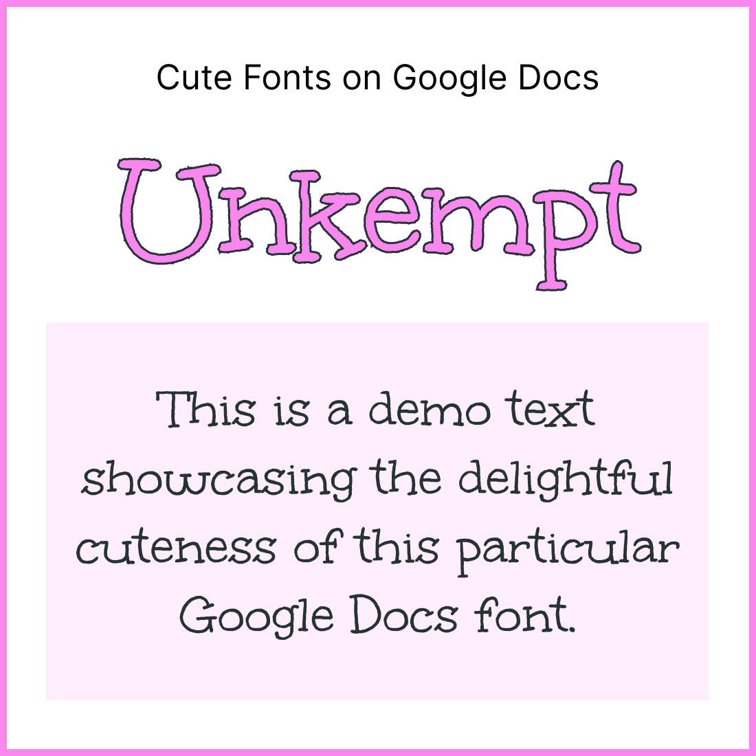
33. Unkempt
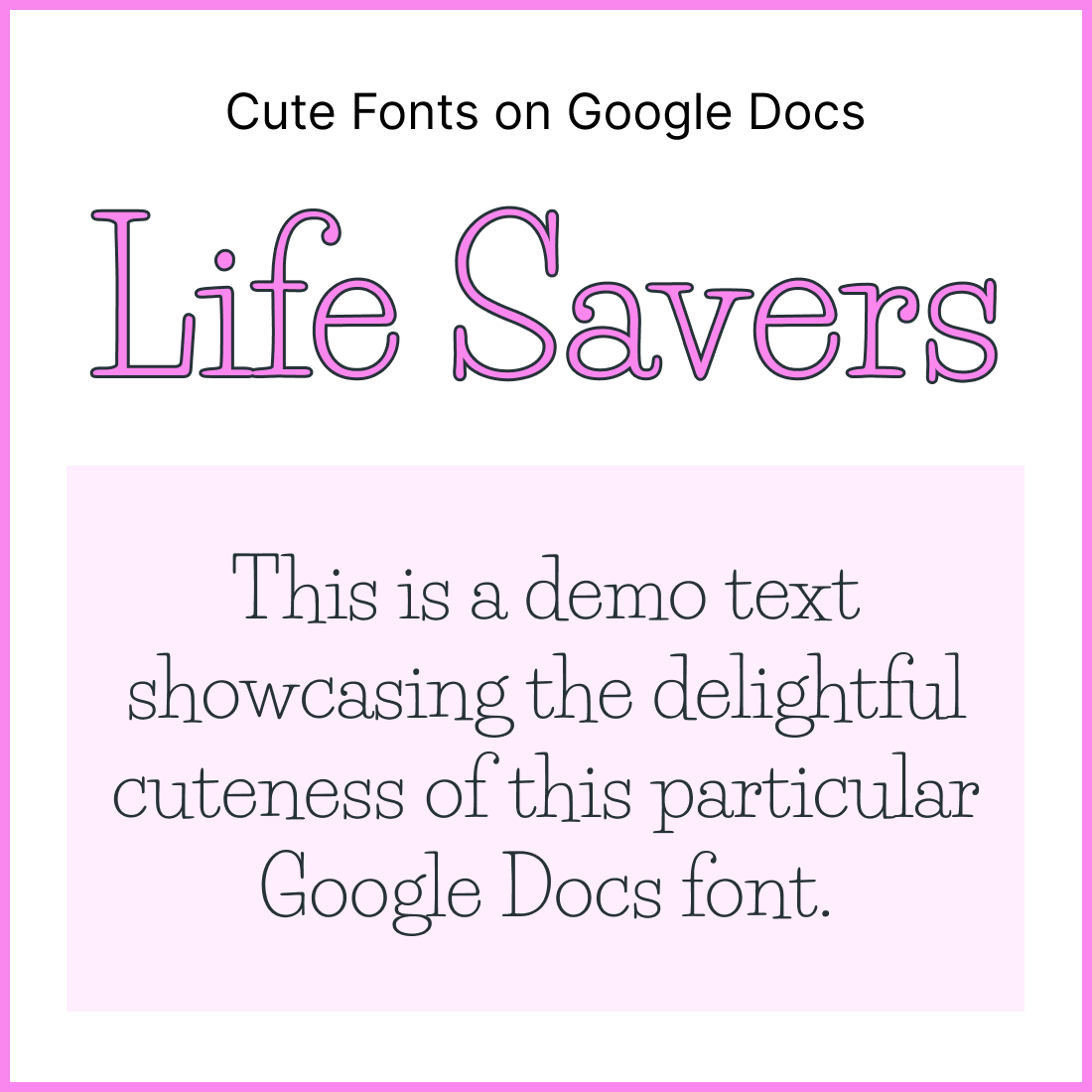
34. Life Savers
35. Hachi Maru Pop
